4/28/11
After practicing HTML and learning to navigate Dreamweaver, I finally finished my webpage. I was inspired by one of Bruce Mau's book cover designs from his Zone Books project. This is my webpage about Bruce Mau.
Wednesday, April 27, 2011
Webpage Layout
4/21/11
For our final project we are designing a webpage. The webpage will be inspired by a work created by our assigned designers. The designer I was assigned was Bruce Mau. I chose one of the book cover designs from his Zone Books project to influence my design.
We will be creating the webpage using Dreamweaver. I drew up a layout of how I plan to organize my webpage. This is a photo of the layout and below it is the book cover that influenced the design.
Thursday, April 7, 2011
HTML Resume
4/7/11
Today in class we learned to use HTML, which stands for Hyper Text Markup Language. We used many examples to help us practice using the HTML tags. This was very helpful and thoroughly explained the difference between a page title and a heading. Our homework assignment was to create a resume using HTML. I've attached images to show what the HTML version of the resume looks like and what it looks like when it's "translated." The bottom window shows what the language looks like when I'm creating my website. The top window is what you see on the actual website.
Today in class we learned to use HTML, which stands for Hyper Text Markup Language. We used many examples to help us practice using the HTML tags. This was very helpful and thoroughly explained the difference between a page title and a heading. Our homework assignment was to create a resume using HTML. I've attached images to show what the HTML version of the resume looks like and what it looks like when it's "translated." The bottom window shows what the language looks like when I'm creating my website. The top window is what you see on the actual website.
Tuesday, April 5, 2011
W3 Schools Notes
4/5/11
HTML
HTML allows you to create your own website.
Intro- HTML is a language used to describe web pages and it stands for Hyper Text Markup Language. There are keywords enclosed in angle brackets called HTML tags.
Get Started- It makes no difference if you save an HTML file as .html or .htm. Dreamweaver and Visual Studio are popular editors used to write and edit HTML.
Basic- The language of HTML can be very confusing but luckily there are some patterns. For example, headings and paragraphs are defined in a similar way. Headings start with <h1> and end with </h1>. While paragraphs start with <p> and end with </p>. Images are a little different because they begin with <img src= and end with />.
CSS
You can save lots of information with CSS.
Intro- CSS stands for Cascading Style Sheets and it explains how to display HTML elements. Styles helped to solve the issue of including fonts and colors in websites because it allowed web developers to store HTML document formatting in a separate CSS file.
Syntax- There is a selector and one or more declarations in a CSS rule. The selector is generally the HTML element you want to fashion. The declaration defines what will be done to the selector. Each declaration has two parts, a property and a value. The property is the style trait you want to alter (such as color) and each property has a value (such as red). For example, if you want to change the color and font size, it would look something like this, {color:red; font-size:14px;}.
Id & Class- Id and class selectors allow you to specify a style for elements. The id selector specifies a style for a single, unique element while the class selector specifies a style for a group of elements. The id selector is described using a “#” and the class selector is described using a “.”
Styling Backgrounds- There are a few different background effects that can be applied using CSS properties. Background color and background images are specified in a similar way. For example, a background color can be defined as {background-color:#42535;} and a background image can be defined as {background-image:url(‘paper.jpg’);}.
Styling Text- You can alter the color, alignment, and indentation of text. You can also alter the decoration and transformation of text. This would include altering text from underlining to uppercase and lowercase letters.
Box Model- Box Model in CSS, refers to the design and layout. Margins, borders, padding and content make up the different parts of a box model from the outside working your way in. To determine the full size of an element, you need to add all four of the elements.
Border- With border properties, you can define all different kinds of borders such as dashed, dotted, solid, ridged, and grooved. You can also determine the width and color of the border.
Outlines- Outlines go outside the border and help to make the element stand out. They can also be altered with color and width.
Margin- The margin is completely transparent. You can determine specific widths for each side of the margin.
Padding- Padding establishes the space around the content but inside the border of an element. Like margins, each side of the padding can be determined individually.
Monday, March 28, 2011
Main Images
3/28/11
I collected images for my magazine cover design. I used my grandpa as a model. I wanted to show him using all sorts of technology. In the photos, he is using a cell phone, laptop, digital camera, DVD player, and iPod.
I collected images for my magazine cover design. I used my grandpa as a model. I wanted to show him using all sorts of technology. In the photos, he is using a cell phone, laptop, digital camera, DVD player, and iPod.
Thursday, March 24, 2011
Masthead Ideas
3/24/11
Today in class we worked on developing our masthead, which is basically the title of the magazine. These are some variations of what types of fonts I'm considering using. I think I've decided to title the magazine RetroTech and I will use the fonts on the left side, third from the bottom.
Today in class we worked on developing our masthead, which is basically the title of the magazine. These are some variations of what types of fonts I'm considering using. I think I've decided to title the magazine RetroTech and I will use the fonts on the left side, third from the bottom.
Tuesday, March 22, 2011
Magazine Cover Design: Sketch
3/22/11
Today in class we had to create sketches for our magazine cover design. The trick was that we weren't using a pencil and paper to sketch we were sketching on the computer using a Wacom tablet. This tablet has a "pen" with it that acts as your mouse. The tablet itself simulated the computer. It was a little challenging at first but by the end of class of felt pretty comfortable with it. This is the sketch I created for my magazine cover design.
Today in class we had to create sketches for our magazine cover design. The trick was that we weren't using a pencil and paper to sketch we were sketching on the computer using a Wacom tablet. This tablet has a "pen" with it that acts as your mouse. The tablet itself simulated the computer. It was a little challenging at first but by the end of class of felt pretty comfortable with it. This is the sketch I created for my magazine cover design.
Thursday, March 17, 2011
Magazine Cover Design: Mood Board
3/17/11
This is my moodboard for my magazine cover design. I tried to incorporate different images, texts, and colors that I'm thinking about including in my magazine cover design. I chose images that were from the past and the present.
This is my moodboard for my magazine cover design. I tried to incorporate different images, texts, and colors that I'm thinking about including in my magazine cover design. I chose images that were from the past and the present.
Magazine Cover Design: Mind Map
3/17/11
Today in class we were introduced to our new project. We have to design a magazine cover. To jump start our thinking process, we created a mind map.
To help us figure out what the focus for our magazine will be, we were asked to answer the following questions:
1. Who is the target audience?
the elderly and anyone over 45
2. What is the name of your magazine? Why? Connotations?
Senior Technology or Geri-Tech or Elder Tech
I want the title to appeal to the elderly and draw them in. I want to include a subtitle that explains what the magazine is about. I don't want my target audience to be turned off by the word technology.
3. What will your masthead look like? Do you have any ideas for fonts?
I want the masthead to include the title and a subtitle. I want to use some sort of serif font to relate to the past.
4. What images will be on the cover and why?
an elderly man or woman holding a cell phone or ipod
5. What will be your sell lines to entice your target audience?
There will be three different levels of instruction, beginner, intermediate, and advanced. (I want to play around with those three words, too) That way the audience will know that each volume will include instruction for each level. So there will be something in the magazine for my entire target audience. I want them to know that the magazine will teach them simple things, for example "how to use an ATM," as well as advanced things like "how to program phone numbers into a cell phone."
Thursday, March 10, 2011
Magazine Ad
3/3/11
Our next assignment was to incorporate ourselves into a magazine ad using Photoshop. I chose an ad that had people with animal heads. I scanned in the magazine ad and then chose a picture of myself. I had to outline my shape using the pen tool in Photoshop. I chose a recent picture of me and my cat and decided to give myself a lion's head, too. Once I outlined the image of me and my cat and the image of the lion, I created a moving path. I copied and pasted those images onto the magazine ad. I had to resize both images to make them proportioned with the other images in the ad. I used the eraser tool to erase the parts of the top images that were overlapping the magazine ad images underneath. Finally, I added some text to tie everything together.
Our next assignment was to incorporate ourselves into a magazine ad using Photoshop. I chose an ad that had people with animal heads. I scanned in the magazine ad and then chose a picture of myself. I had to outline my shape using the pen tool in Photoshop. I chose a recent picture of me and my cat and decided to give myself a lion's head, too. Once I outlined the image of me and my cat and the image of the lion, I created a moving path. I copied and pasted those images onto the magazine ad. I had to resize both images to make them proportioned with the other images in the ad. I used the eraser tool to erase the parts of the top images that were overlapping the magazine ad images underneath. Finally, I added some text to tie everything together.
Wednesday, March 2, 2011
Understanding Types of Images
3/1/11
Last class period we were introduced to InDesign and Photoshop. I had never used either program before but it was really interesting to see how well they work together. In class, we were given a document to recreate using these two programs. The document included some images that required us to scan images from magazines. After we scanned in the image, it was time to alter the overall color of the image. I found this to be the most challenging part of the assignment. Here is my final recreation.
Last class period we were introduced to InDesign and Photoshop. I had never used either program before but it was really interesting to see how well they work together. In class, we were given a document to recreate using these two programs. The document included some images that required us to scan images from magazines. After we scanned in the image, it was time to alter the overall color of the image. I found this to be the most challenging part of the assignment. Here is my final recreation.
Tuesday, March 1, 2011
Google SketchUp House
3/1/11
Here are some images of my house that I recreated using Google SketchUp. I enjoyed making this house because it's 3D (which I prefer over 2D). I wish I could have gotten more detail in the windows but it was hard to select only certain sections. Overall, I'm pretty happy with the way it turned out.
Here are some images of my house that I recreated using Google SketchUp. I enjoyed making this house because it's 3D (which I prefer over 2D). I wish I could have gotten more detail in the windows but it was hard to select only certain sections. Overall, I'm pretty happy with the way it turned out.
Photos of House
2/24/11
Today in class we learned how to use Google SketchUp. This program works in 3D unlike the first program learned, Adobe Illustrator, which works in 2D. I like working with Google SketchUp for this reason. Our first exercise with this new program involved us having to recreate a house. We had to first take photos of all the sides of a house. These are the photos I referenced while creating the house in Google SketchUp.
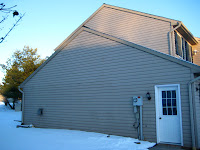
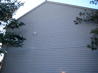
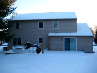
Today in class we learned how to use Google SketchUp. This program works in 3D unlike the first program learned, Adobe Illustrator, which works in 2D. I like working with Google SketchUp for this reason. Our first exercise with this new program involved us having to recreate a house. We had to first take photos of all the sides of a house. These are the photos I referenced while creating the house in Google SketchUp.


Tuesday, February 22, 2011
Final Seed Packets
2/22/11
Here are all of my refined seed packets. I added a lot of gradient pieces to the stems in the egg plant, the leaves in the bread plant, and the greens of the milk plant. I think it added a lot more depth to them all. I also added soil to all the plants. I think this makes them look more like plants. For the final packet, the bread packet, I wanted to capture the bread almost "blooming" from the stems of the plant. I finally resolved the issue of the title. I added a bluish border on top and added a curved line to make it a little more interesting. I decided to do away with the sticky note idea. I really like how they all turned out. I think all the plants really compliment one another.
Here are all of my refined seed packets. I added a lot of gradient pieces to the stems in the egg plant, the leaves in the bread plant, and the greens of the milk plant. I think it added a lot more depth to them all. I also added soil to all the plants. I think this makes them look more like plants. For the final packet, the bread packet, I wanted to capture the bread almost "blooming" from the stems of the plant. I finally resolved the issue of the title. I added a bluish border on top and added a curved line to make it a little more interesting. I decided to do away with the sticky note idea. I really like how they all turned out. I think all the plants really compliment one another.
Monday, February 14, 2011
Second Seed Packet
2/14/11
Here are my updated seed packets. I altered the original "egg plant" and the directions on the back. I also created the milk plant which resembles carrots growing in the ground.
Here are my updated seed packets. I altered the original "egg plant" and the directions on the back. I also created the milk plant which resembles carrots growing in the ground.
Monday, February 7, 2011
First Seed Packet
2/6/11
For our first project, we had to create and design seed packets. My seed packet collection was entitled The Essentials. I wanted to poke fun of the fact that once there is news of a winter storm, everyone runs to the supermarket to buy bread, milk, and eggs. My seed packets will eliminate the crowd at the supermarket because you can grow your own essentials. This is the first of three seed packets I will create. This one allows you to grow your own eggs. The next two allow you to grow bread and milk.
Wednesday, February 2, 2011
Mood Board
2/1/11
Mood boards are a great way to layout a new design idea. In my mood board, I displayed all the ideas I had for the Seed Packet project. I wanted people to get the sense that these things, bread, milk and eggs, are the essentials for any big snow storm. I want the scheme of the seed packet to include the fonts and colors I used. I would like the background of the seed packet to look like a grocery list. Each packet will have a plant that is growing one of the essentials.
Mood boards are a great way to layout a new design idea. In my mood board, I displayed all the ideas I had for the Seed Packet project. I wanted people to get the sense that these things, bread, milk and eggs, are the essentials for any big snow storm. I want the scheme of the seed packet to include the fonts and colors I used. I would like the background of the seed packet to look like a grocery list. Each packet will have a plant that is growing one of the essentials.
Tuesday, February 1, 2011
Mind Mapping
2/1/11
We practiced a mind mapping exercise to help us better understand the Seed Packet Project. It was very interesting to see the different connections that were made.
We practiced a mind mapping exercise to help us better understand the Seed Packet Project. It was very interesting to see the different connections that were made.
Monday, January 31, 2011
Fruit Translation
2/1/11
For our fruit translation exercise we had a choice of two different pieces of fruit to recreate. I chose the peach because I thought it was more realistic than the other fruit. I also really liked the transition of color along the outside of the peach in the back. Using the gradient tool was a challenge but I'm fairly happy with the outcome of this piece.
For our fruit translation exercise we had a choice of two different pieces of fruit to recreate. I chose the peach because I thought it was more realistic than the other fruit. I also really liked the transition of color along the outside of the peach in the back. Using the gradient tool was a challenge but I'm fairly happy with the outcome of this piece.
Logo Translation
1/27/11
The Logo Exercise showed our ability to recreate logos using Adobe Illustrator. We were given eight logos and we had to choose four to recreate. I chose the FedEx, WWF, Texaco, and Chilis logos because I felt they would best show my ability to use the shape and pen tools.
Tuesday, January 25, 2011
Circle Exercise
1/20/11
For this exercise, we used Adobe Illustrator to create a design using only black circles. We were required to have at least 100 circles. This was my first time using Adobe Illustrator. It was a great way to practice creating shapes and moving them around the artboard.
Video Responses
1/18/11
The first video we watched about “Computer Literacy for the Mac” explained what operating systems are and why they’re important for running programs on a computer. It’s important to always have the most up-to-date operating system. This will ensure that you’ll be able to download and use most applications. The newest operating systems for Mac and Microsoft are Mac OS X and Windows 7, respectively. Most applications are available for Mac and Windows.
The second video taught us how to properly use folders. The narrator interactively displayed a folder and showed us all the possible ways to view the folder and its contents. We learned that after double clicking on the folder icon that appears on your desktop, you are able to choose which display you prefer to view the folder’s contents. List view displays additional material such as the size of the folder and when it was created. Column view allows you to track the path you took to get to the contents. Sub-folders can also be created to organize the contents of the folder. Both videos were concise and I learned a lot of new information. The narration during the interactive display was very easy to follow and helpful.
Subscribe to:
Comments (Atom)


